Short Description
This protocol allows you to use easily ICY SODA plugin to analyse colocalization and/or indirect association between 2 channels (green and red) within a cell mask segmented thanks to HK-Means methods. Follows the instructions, and analysis will be available without any coding.
We have published ICY SODA plugin in Lagache et al. Nature Comm 2018. See movies and paper on my website :http://lydia.danglot.free.fr/Publications-en.html
You can cite directly this protocol with: DANGLOT Lydia. (2020, June 28). Easy Cell shape with HK-Means protocol – graphical programming for Icy software. Zenodo. http://doi.org/10.5281/zenodo.4317783
You can cite the associated dataset with: DANGLOT Lydia. (2020). Neuronal cell labelled with anti PSD95 and homer antibodies – sample image for software testing of Easy SODA [Data set]. Zenodo. http://doi.org/10.5281/zenodo.4323312
Please also cite SODA plugin paper (Lagache et al. Nature Comm 2018).
- CATEGORIES
- #morphology
- #segmentation
- #spot_count
Institution: INSERM
Website: http://lydia.danglot.free.fr
Documentation
See INSERM press release here : https://www.inserm.fr/actualites-et-evenements/actualites/soda-nouvel-outil-analyse-pour-imagerie-fluorescence
Beyond this protocol, you can find a whole familly of protocols using SODA plugin by typing SODA in the Icy Search bar. You will find protocls for 2 or 3 colors in conventional microscopy and super-resolution with 2D STORM and 3D STORM (see also Thibault Lagache ones).
This particular protocol will allow you to analyse 1 image (2D or 3D) using spot detector, HKmean and Icy SODA plugins. It will adapt automatically to 3D if your data is in 3D.
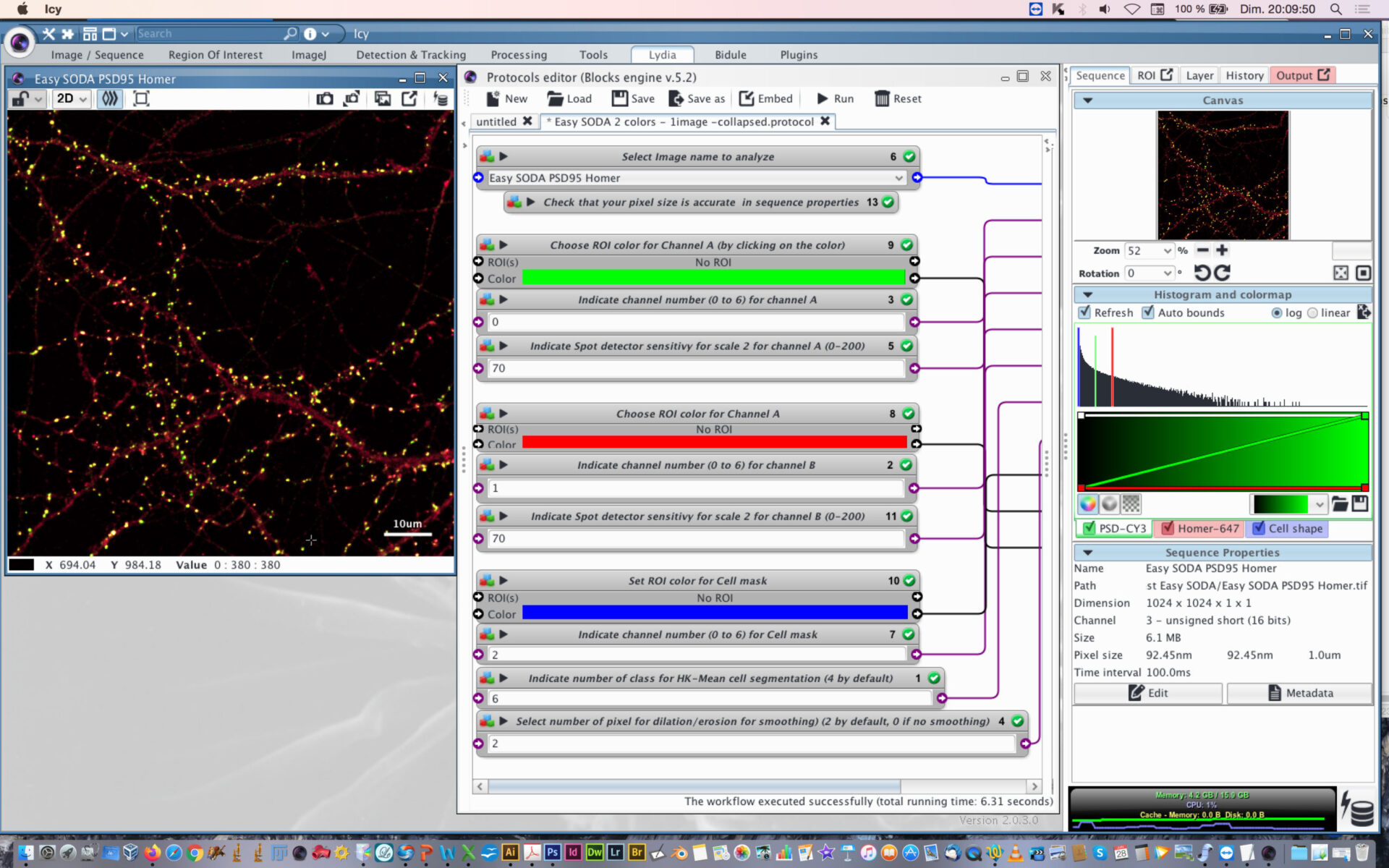
- Open protocol editor.
- Load Easy Icy SODA protocol
- Open the desired image to analyze or this example image used here to explain the Easy SODA protocol
- Within protocol editor, select within block #6 the image to analyze.
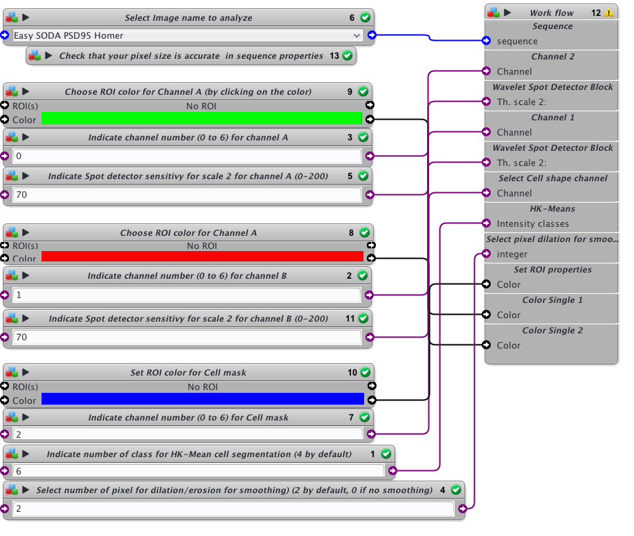
- Check that the pixel size is accurate in sequence properties because distance will rely on metadata.
- Chose the first channel to analyse and its rendering color (Block #9 and #3, here green is selected). The color can be changed by clicking on the colored square and chossing a new one on the chromatic circle, then press OK.
- Chose the scale sensitivity to use for spot detector segmentation (Block #5). 70-100 is usual. If you have a good signal to noise ratio you can decrease the sensitivity to 30-50. If you need to retrieve more spots that usual, then increase sensitivity over 100.
- Chose the second channel to analyse and its rendering color (Block #8 and #2, here red is selected).
- Chose the scale sensitivity to use for spot detector segmentation (Block #11) on the second channel. You can also use my protocol “Rainbow-spot-detector-scale-finder” on your image, to find the right sensitivity before using Easy SODA protocol.
- Indicate the channel to use for cell mask detection (Block #7) and its rendering color (Block #10, here blue is selected).
- Indicate the number of class to use with HK-Means method. 2 is closed to conventional thresholding. By increasing the number you will increase the surface segmented. If you want to proceed to tests before SODA analysis, you can use my protocol “Easy Cell shape with HK-Mean“, it will help you to find the adapted class number.
- Indicate if you want to smooth the mask or not. Enter 0 for no smothing. If smothing, you can enter the number of pixels used for dilatation/erosion process. 2 is usual. Be carefull not to put too much or your mask will be too fat.
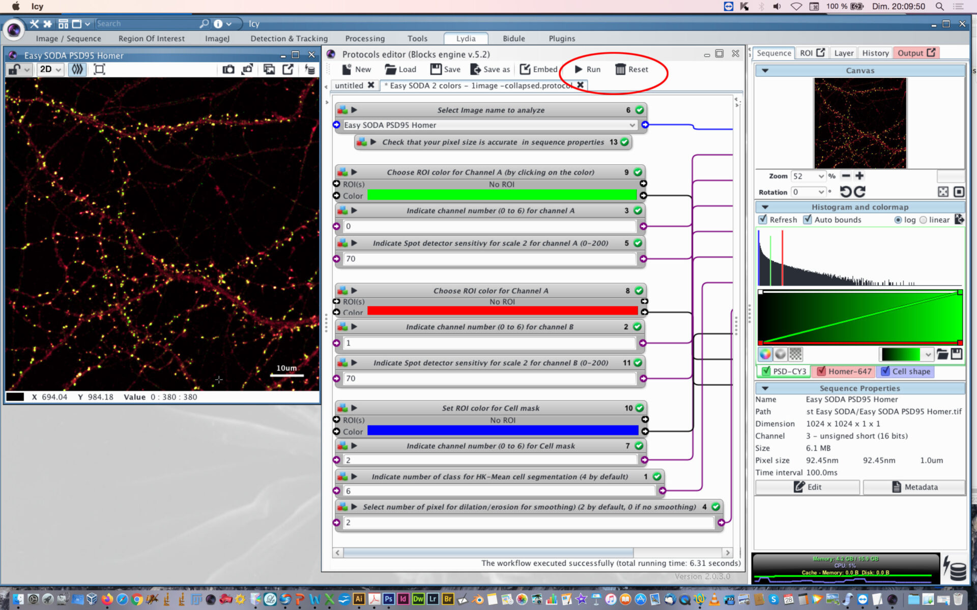
- When everything is set, press the Reset button, and then press Play button.
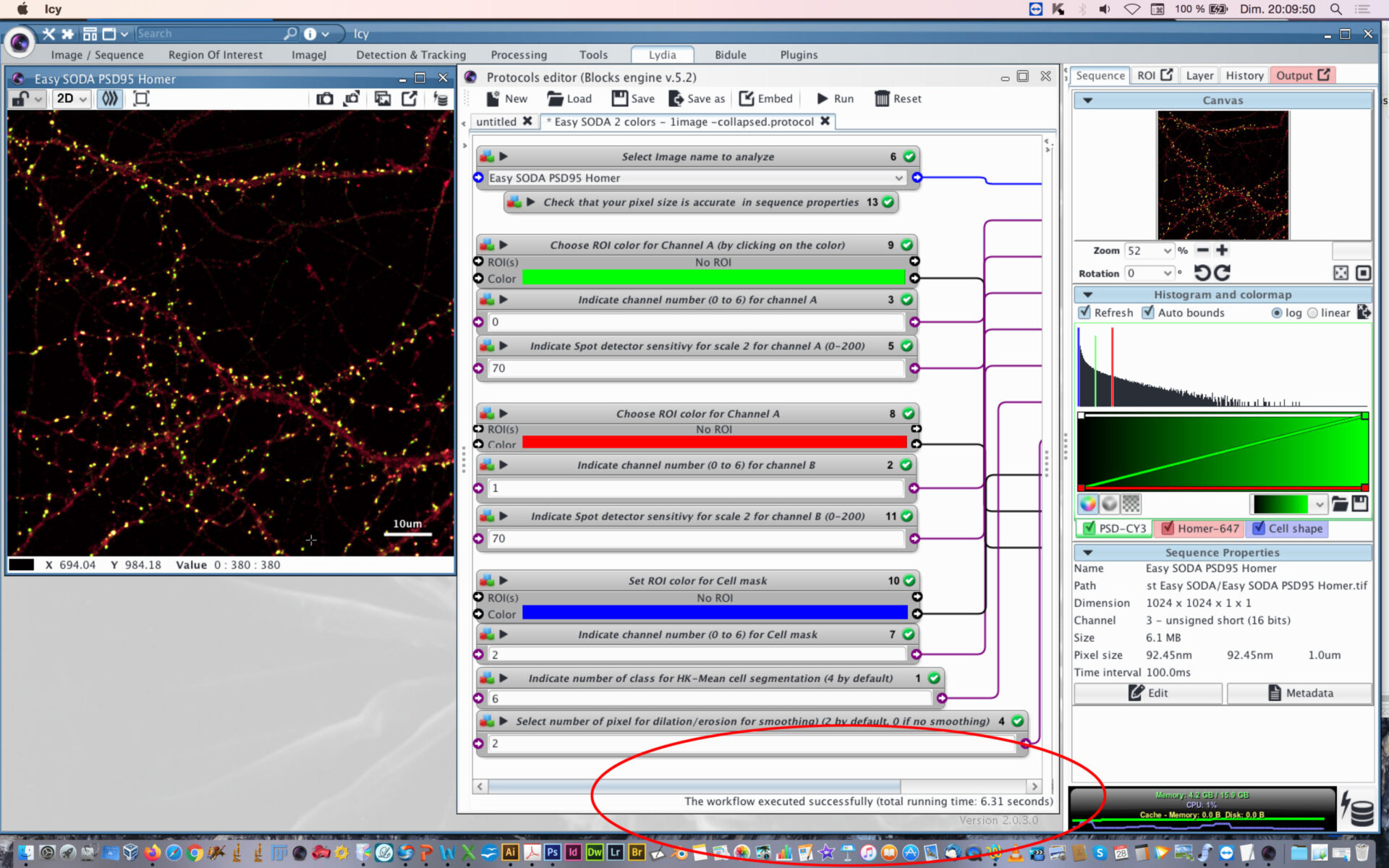
- You can follow the execution of the workflow at the bottom part of the protocol editor.

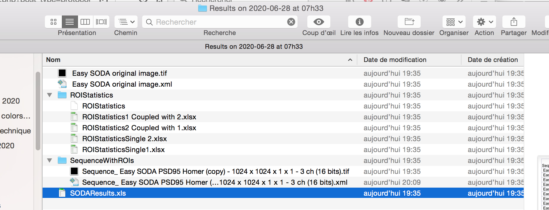
- When the workflow will be executed, you will find next to your image on the hard drive, a new folder called Results with the date and Time.
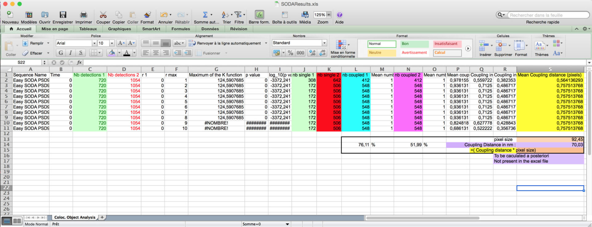
- Inside the folder, you will find excel files corresponding to SODA distance analysis between Red and Green associated spots, with the biological significance (pvalue) : SODAResults.xls

- You will find the number of spots in green channel (column C) and in red channel (column D), the number of isolated green spots (column J), the number of isolated red spots (column K), and the number of green (Column L) and red (N) that are statistically associated.
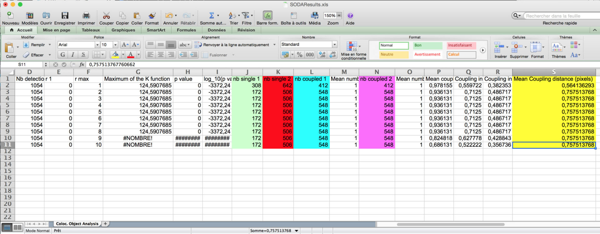
You can then calculate the proprotion of associated green and red spots, and the coupling distance when associated (light purple) by multiplying the Mean coupling distance (in yellow) in pixel by the pixel size (orange).
- The other excels files gives you the are of the spots, their intensity, and their distance if coupled.
- The new image file named with the suffix “with colored clusters.tif ” contains all the ROI generated by the HK-Mean for the blue Cell shape and the clusters coded following SODA colors.
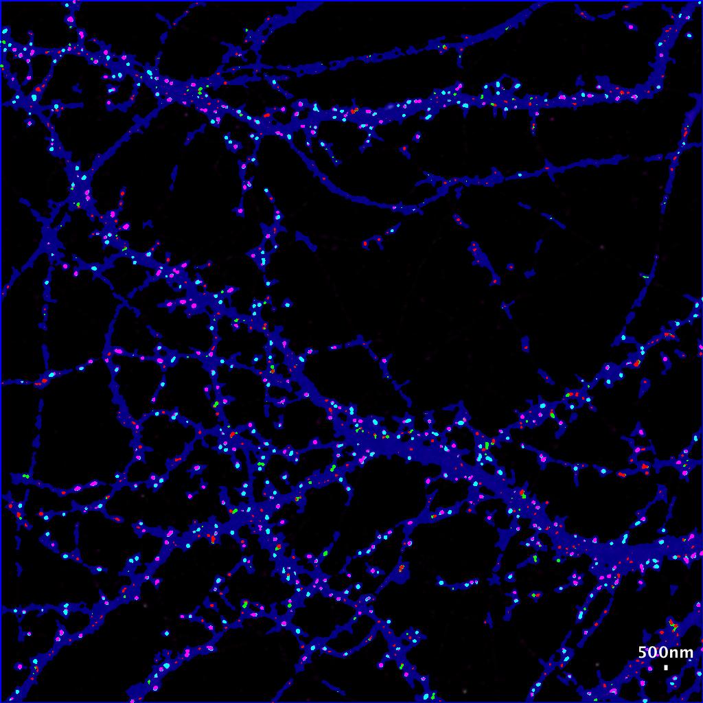
- By default :
- isolated green spits remains green.
- Green spots statistically associated with red spots become cyan.
- Isolated red spots remains red.
- Red spots statistically associated with red spots become pink.
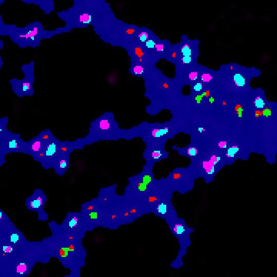
Now you can easily see at a glance where are associated green and red spots within the cell, with strong statistics in excel file.
We hope that you will enjoy this protocol. Take time to reward this protocol with Stars if it helps you in your analysis.